Photo by José R. Almodóvar Rivera
Savia Science
HOW TO DEVELOP A BRAND IDENTITY THAT FOSTERS CURIOSITY BY LEARNING SCIENCE WITHIN A LOCAL CONTEXT?
Client: SM Puerto Rico
Roles: art direction, senior designer, design & market research
Brief
SM is a Spanish publisher with a strong presence in Latin America, operating in nine countries, including Puerto Rico. It specializes in publishing educational texts and materials, fiction for children and teenagers.
Faced with the challenge of improving market positioning of existing Science textbook series with failing sales and low school adoption rates, I supervised the creation of a new, fresh brand system that would lead to a successful reception of the new products, an increase in school adoptions, and greater industry and brand awareness. The rebranding had to be appealing for both existing users that were already familiar with the publisher’s products, but also had to feel approachable for the potential new user/adoptions. And most importantly, SM needed to be seen as an innovator in their industry and stand out from their competitors.
Total Individual Components Designed for this Project
56
Science Textbook Users in Target Market
101K

Brand System
INNOVATION THAT APPEALS TO TEACHERS AND EXCITES STUDENTS
Our core users were Primary School teachers and students from grades K to 6; with this in mind, a total design overhaul of the series and all its components gave place to a completely new brand system: typography, color palette, icon set, brand guidelines...altogether, an extended visual language that screamed ‘Science’!
TYPOGRAPHY
GRADES
K-3
4-6

COLOR PALETTE
BRAND COLORS

SECONDARY COLORS


ICON SET

Covers
LOCALIZING SCIENCE AND MAKING IT APPROACHABLE
Market analysis revealed an urgent need for Science textbooks with local and regional context.The previous Science series had very weak sales and poor adoption rates, one of the reasons being that their overall look was not ‘attractive, inviting, appealing, innovative’ enough, starting with the covers which featured portraits of children instead of Science-related subjects. The solution was to replace the children with highly detailed closeups of animal species native to the local ecosystem.
Each book opens with an informative text filled with curious facts about the habits and habitat of the animal on the cover.

Layouts
TEACHING AND LEARNING SCIENCE SHOULD BE FUN AND ENGAGING!
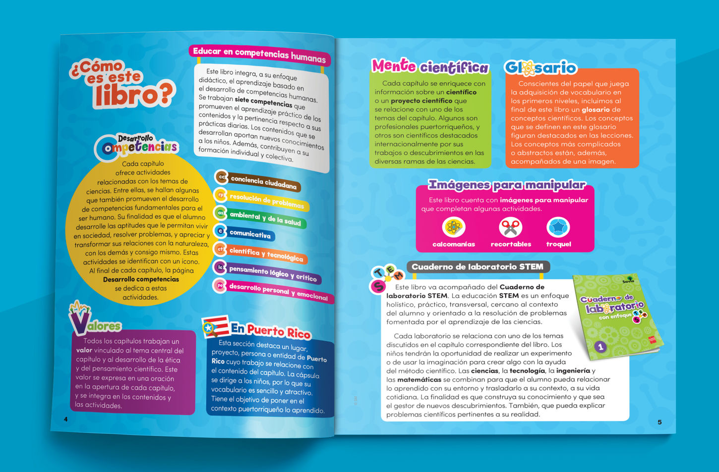
Market analysis revealed a strong preference for the english-written books by US publishers. With this in mind, we worked in close collaboration with the Editorial Department to develop an engaging and dynamic content layout and page design where images and infographics take center stage, yet the texts and activities are well distributed. I developed, designed, and oversaw the implementation of this extended visual language: layouts, titles and headers, themed sections, themed backgrounds, illustration and infographic styles.
UNIT & CHAPTER OPENERS
PAGE LAYOUTS


'SCIENTIFIC MIND'
Users expressed they would like to see an integration of accomplished local & international scientists and their contributions to Science. Along with the editors, we worked on the development and illustration of these scientist characters that would be featured on the chapter's 'magazine section. These are some examples:

Add-ons
SUPPLEMENTARY COMPONENTS INCLUDED
In addition to the student textbooks, other complementary materials designed for this series include:
-
Laboratory Workbook
-
Teacher's Guide
-
Posters for the classroom
-
Stickers and cut-outs related to textbook activities with its enclosing folder